
UI / INTERACTON DESIGN
___
Goodwork
Mobile app
My role
Goodwork's mobile app is a place for tradies to find jobs, hire workers and connect with each other.
..............
I joined the Goodwork team to help re-design some key features, improve various UI components and interactions throughout the app. I also played a part in the transition towards an updated UI style and the very beginnings of their design system.
I lead user testing sessions and worked closely with the cross-functional team in an agile environment where a number of important updates were released.
Tools used
Key design objectives
– Improve the UI/UX in the key areas (user tasks) in the app
– Help move Goodwork towards a more consistent and cohesive UI style
– Begin to create Goodwork’s component library for the new design system
Who we're
designing for
The first week at Goodwork involved lots of discussion and questions around the product with team members and immediate stakeholders, looking at the business objectives, understanding who we were designing for and looking at the user goals, needs and behaviour as part of the initial steps in the process.
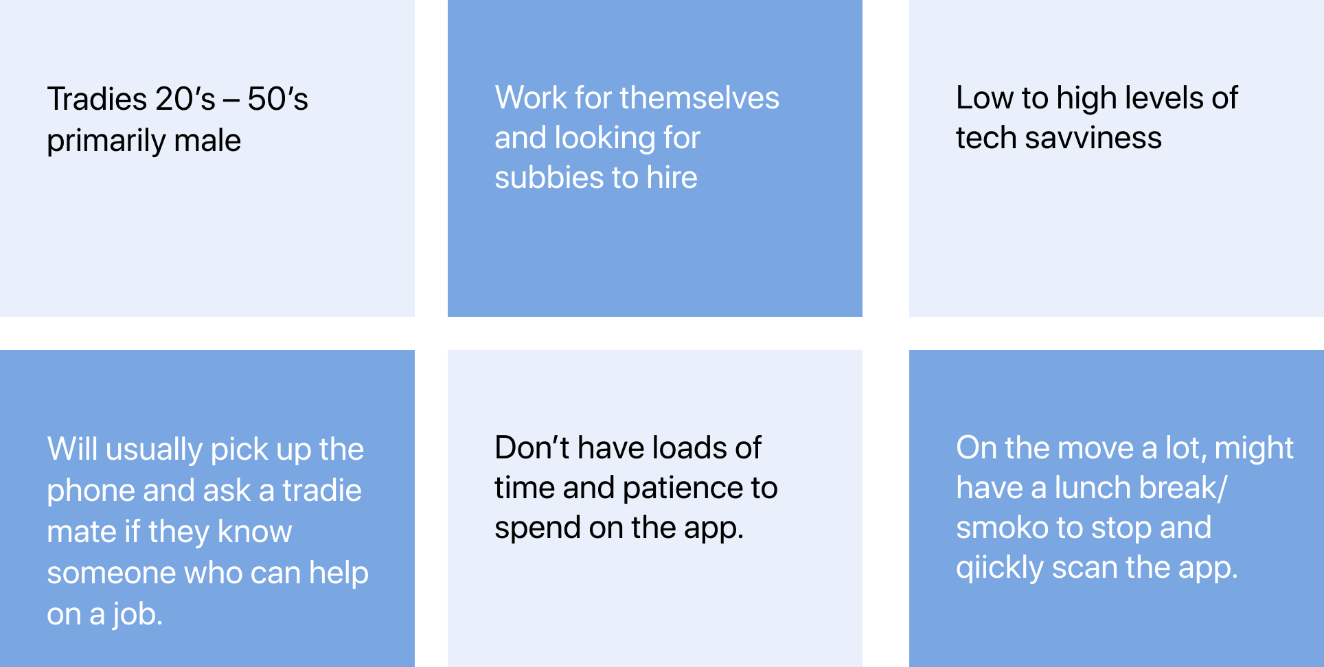
Blue collar workers covering all trades from plumbers, bricklayers to landscapers and electricians. Tradies who work for themselves or who run a small business who often need to find sub-contractors quickly or find a job.
Design/expert review
I conducted a design review of all the key tasks and looked out for any UI/UX and usability issues (low, med, high, critical severity).
A part of this, I considered the following:
– Design principles / Heuristics
– Accessibility standards
– Common design patterns and best practices
The aim was for me to familiarise myself with the product while also assessing whether there were any obvious issues we could fix immediately and other assumptions we could validate in the user testing sessions.
.............
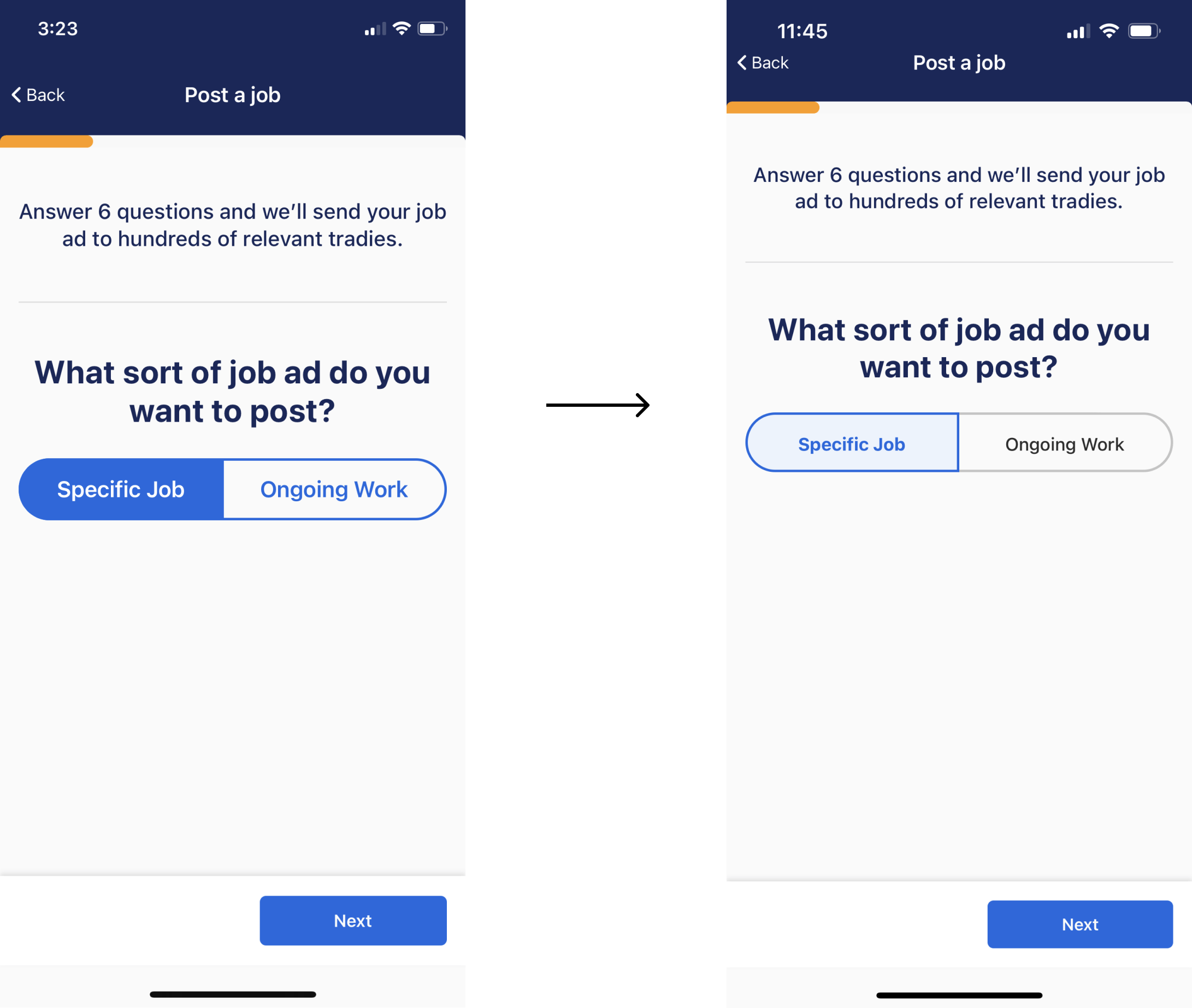
This video example on the left, shows the task of posting a job and demonstrates the transitions as the user moves through the form are not a common interaction design pattern.
The recommended approach was for the first screen to slide up as you enter the form, then moving through each step by tapping the 'next button', would transition to the next screen from the right.
The interaction design issue was considered low severity, and if improved would help the users ease of use and create a more fluid flow but not critical where it stopped the user from completing their task.
We therefore put it in the backlog.
Talking to tradies
As evidence based design was the goal, usability testing sessons were conducted early on to gain feedback on the most important tasks throughout the app.
We wanted to validate some of our assumptions and then improve these tasks by:
– Finding friction points
– Finding inconsistencies
– Finding design hierarchy issues
I interviewed six tradies (not existing users) remotely via Askable Live and we gathered some extremely valuable insights.
These insights helped lead us to where we needed to focus on improving first.


What we learned
1. We heard that tradies wanted to get on the app and not hang around like users of Linkedin might be more likely to do. They wanted to jump on and complete their goal quickly and then get off the app. Finding a subbie or finding a job were the main needs.
2. There was a bit of confusion about what they were looking at and what they should do when landing on the home screen for the first time.
3. It was interesting to see that the users pathway to finding jobs was mostly via the bottom navigation, completely ignoring the big round '+' button. We could then understand why they were doing this.
So, we needed to take a task orientated design approach and make sure tradies could get these tasks done as quickly and easily as possible.
Quantitative + qualitative data.
In addition to user testing we looked at analytics to help us uncover where we should focus our efforts in improving the key journeys/tasks.
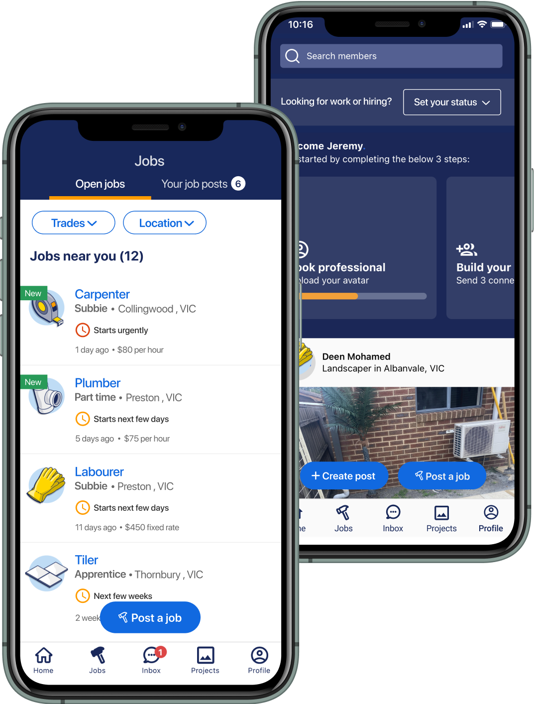
For example, analytics showed us that users were rarely tapping the round ‘+ button' on the home screen. They were accessing the ‘posting jobs’ feature via the jobs screen a lot more often.
User testing helped us learn that users didn’t know what this button was and some people didn’t even see the button at all. So overall they were not at all confident in how they should go about posting a job.
.
.

Tech feasibility
An important part of the whole process within the team, was to have regular tech feasibility and feedback sessions with the engineers.
This was cruitial in preparing them for what was upcoming in the next sprint meeting and most importantly finding out if any issues existed in implementing the new designs. And any design feedback from the devs was always helpful and welcoming.
User testing was important to carry out early on to help inform some of the things we wanted to implement. In addition, the design review and data analytics pointed us in the right direction.
4 important areas we focused on
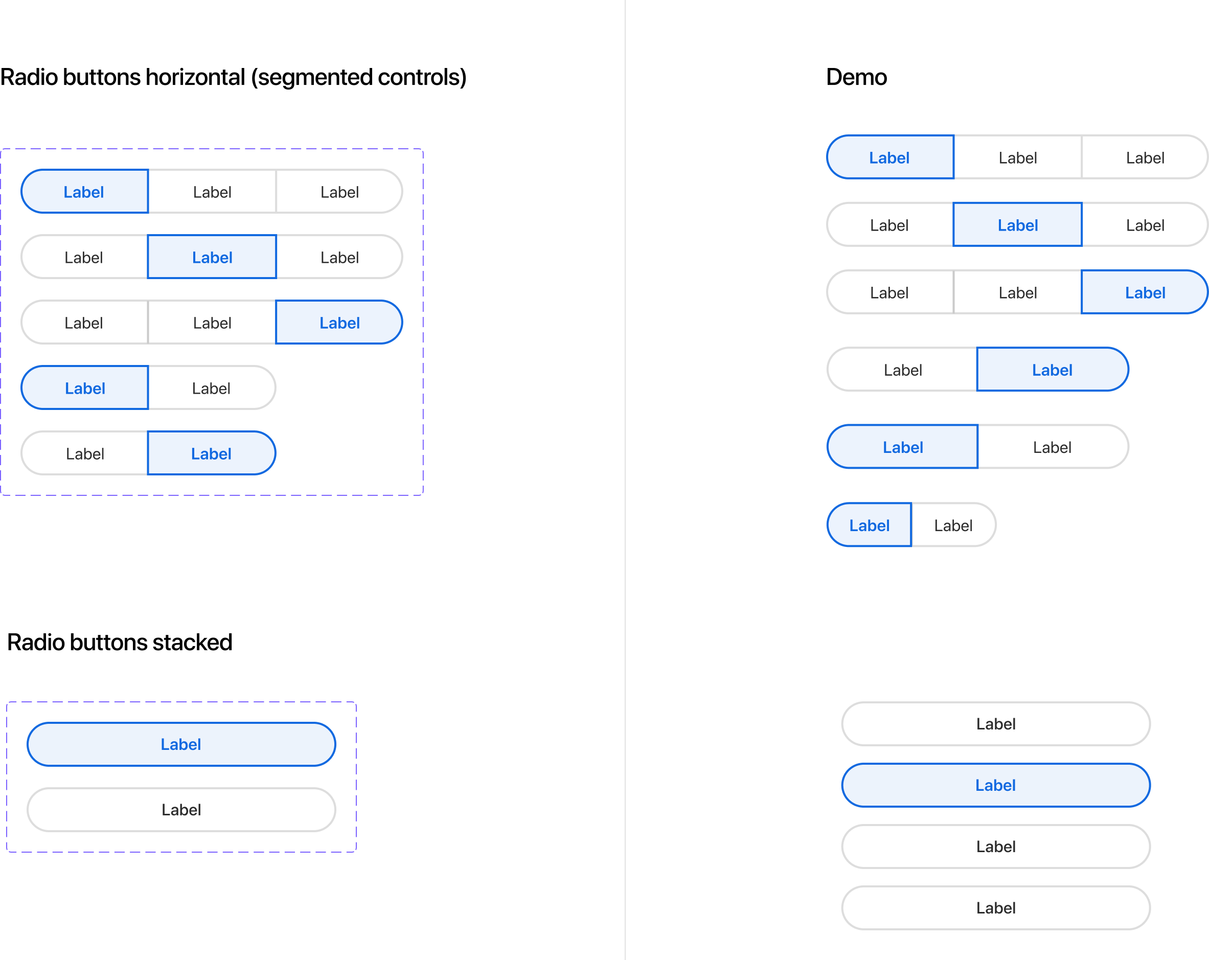
– Improving button styles and hierarchy across the app – rounded floating, form buttons and radio buttons.
– Exploration for ‘my status’ feature – enabling users to select their own work status (availability)
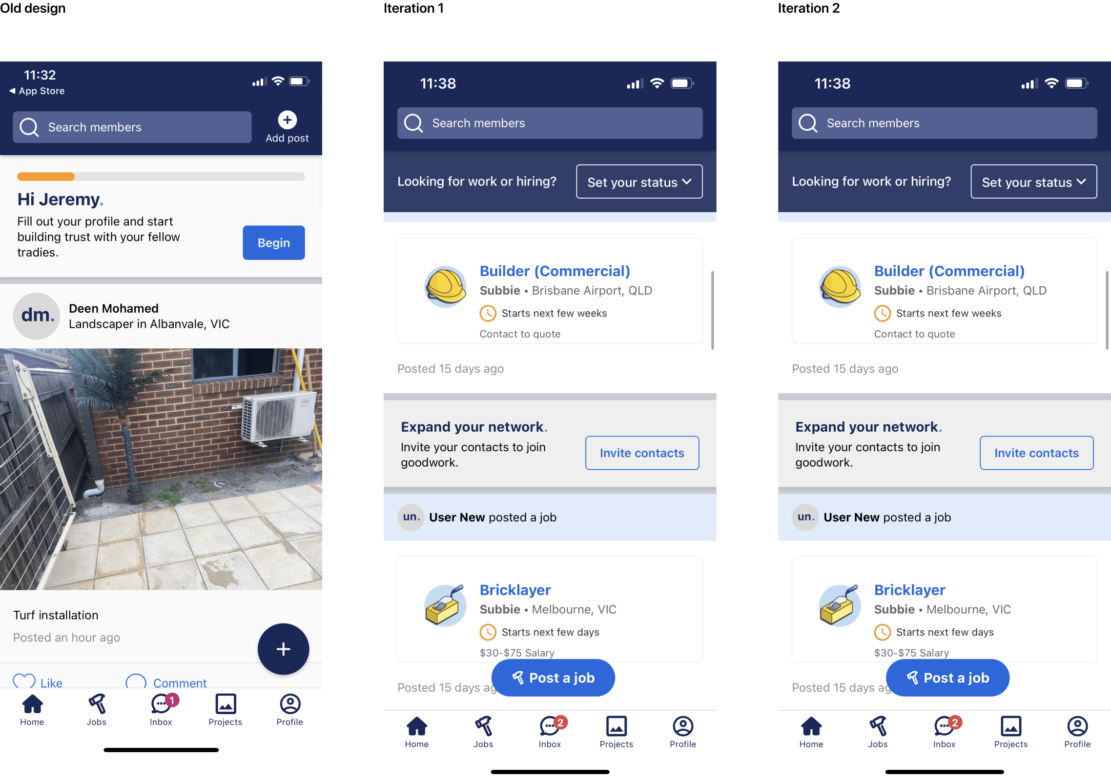
– A significant re-design of the job cards to help job discoverability and visibility of jobs
– Post job form - various updates to improve the experience of this key user flow/task
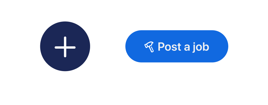
Buttons, links and CTA updates
The floating round button issue
The problem and how it was idenfited
The home screen floating round button was a vital CTA which enabled users to complete a number of important tasks. But users weren’t clear as to what this button was for and what it’s purpose was. We also found users weren’t tapping the button much at all. Both user testing and data analyics helped us identify these problems.
Solution
We wanted to improve usability and findability so users knew immediately what to do and what the button did. Two new buttons were created with explicit text for the first iteration, we then ended up opting for one single button for more simplicity.
This button was a crucial CTA which lead users to one of the most important tasks of finding workers.
UI audit + exploration
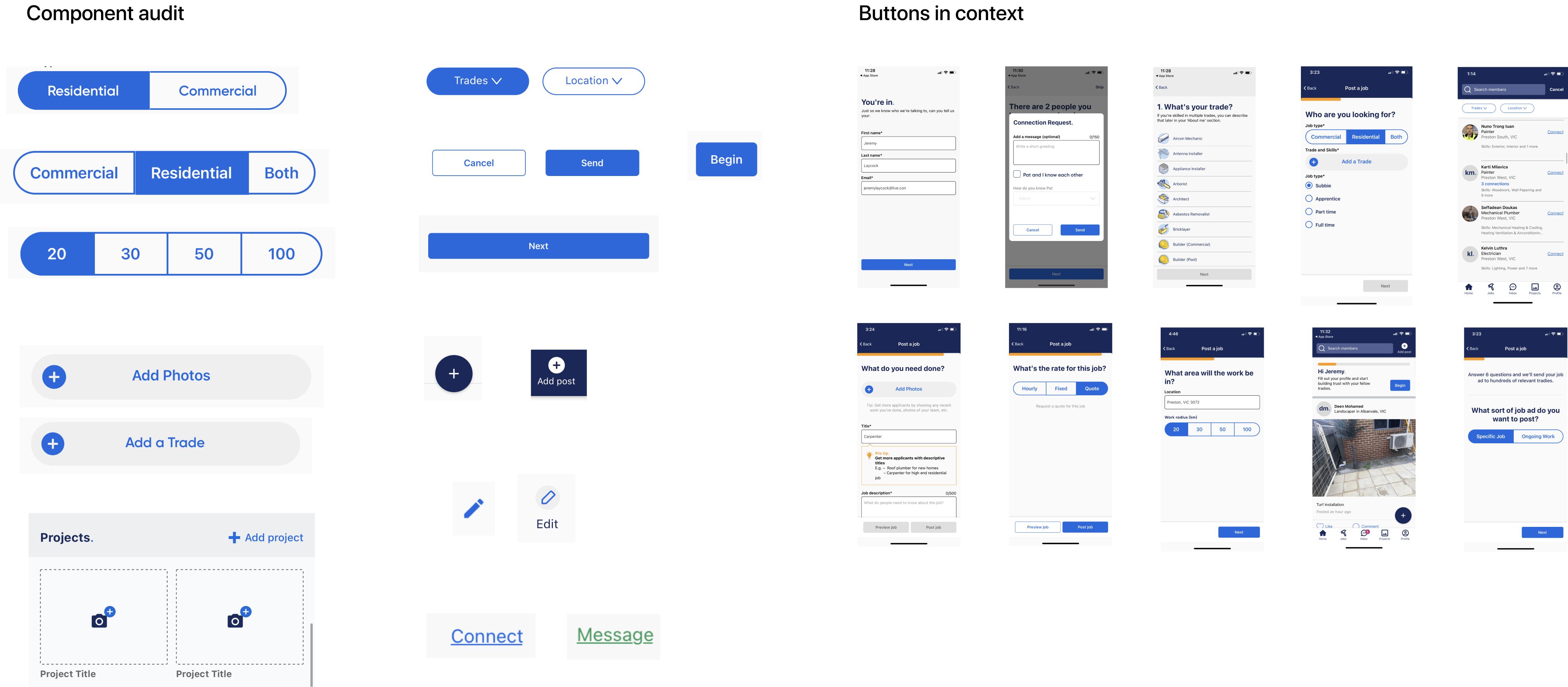
As part of developing a common interface language, we decided to review all buttons, links and CTA's throughout the app and see where we could improve the UI and usability.
1. The first design task was to audit the whole app looking all the buttons, where they were and what they looked like.
2. Looked for UI inconsistencies and assessed components for adherence to design best practise.
3. Considered how these components were interacted in context with key user task flows
4. Explored solutions (collaborating with product lead) to address the design problems we found.
5. Ran through solutions with team members to receive any further feedback and input.
6. Iterated on solutions and finalised designs with redlines and annotations for engineers.
7. Added components to design system - created Figma master components and varients.
Design problems + solutions
We found there were outdated and inconsistent styles for many of the UI elements:
– multiple icons for the same action
– inconsistent colours and styles for links
– tap region size inadequate for accessibility standards
– CTA buttons hidden when keyboard is in view
– issues with button hierarchy.
There was often no differenciation between primary and secondary buttons styles. Buttons which had more importance often looked the same as buttons with seconday importance which was problematic.
I explored new styles for radio and secondary buttons to reduce friction and help users move through flows/tasks with the least amount of effort.
Primary and secondary exploration
Outcomes
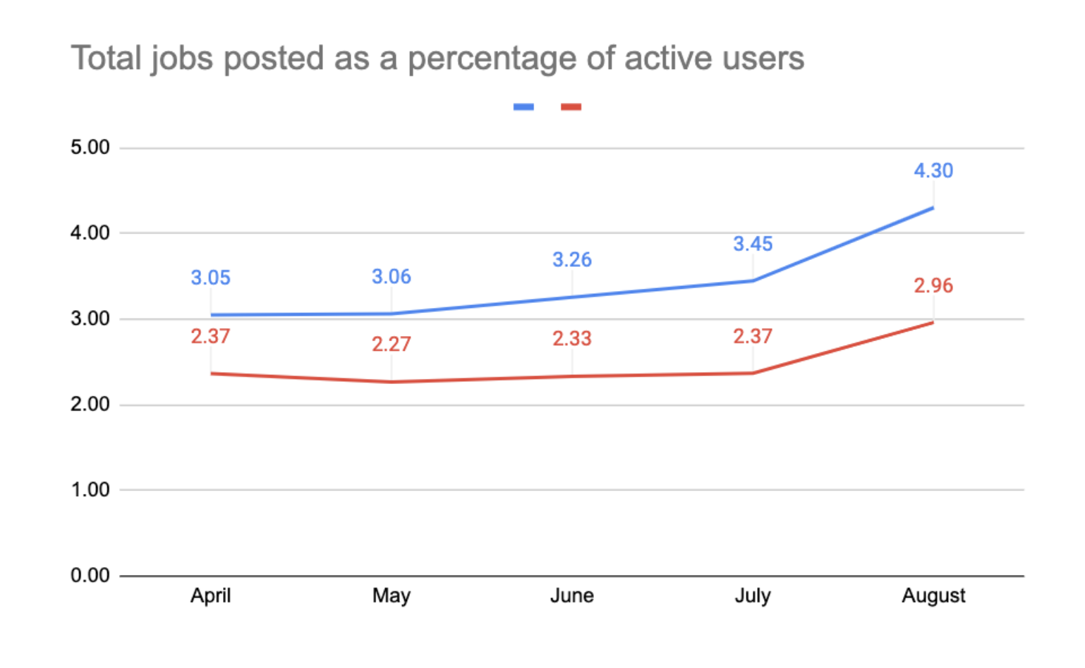
Some early data over the month since implementing the home screen buttons showed there was an approx increase of 26% in unique users posting jobs. We thought that the updated buttons were likley a major contributor to this. This was early data but still a very promising sign.
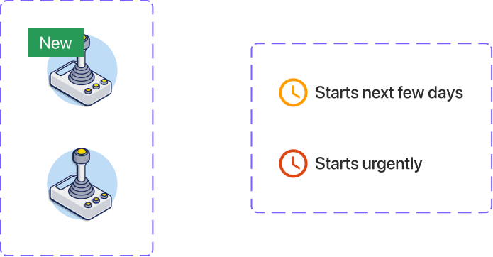
Setting the user's status
The 'set status' feature was an important one to explore and we saw it having lots of potential in helping tradies engage more with the core tasks – 'finding jobs' and 'finding subbies' and thus achieving their goals quickly and more easily.
We explored different UI ideas and approaches for each scenario eg selecting status from the home screen, from the users own profile screen and viewing other peoples profile showing their work status.

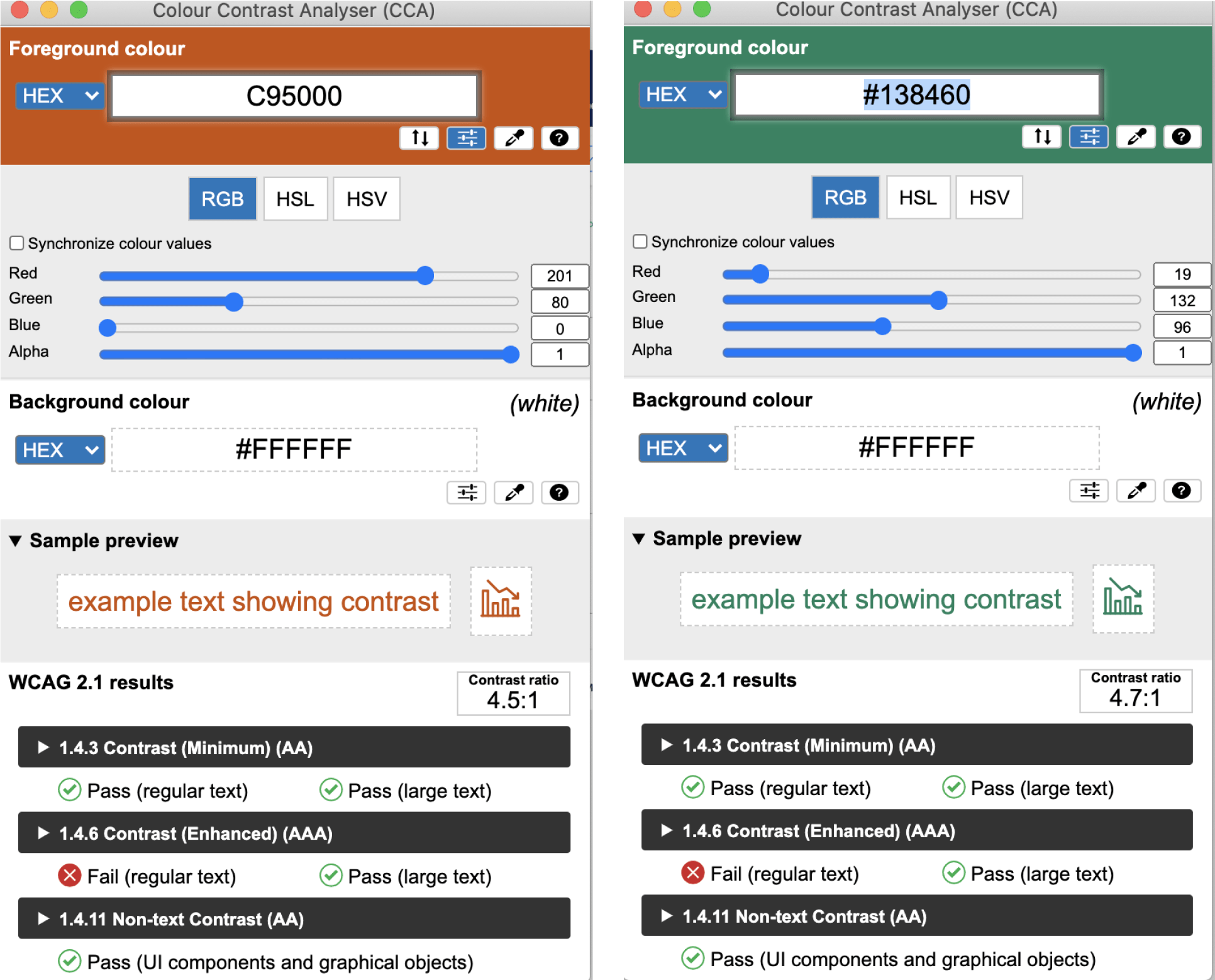
Accessibility design matters
With accessibility and design principles always in mind, I made sure the colour contrast ratio for the status feature passed WCAG standards, AA at a minumum.
Along with colour being accessible to tradies, other important factors were considered such as button size, icons paired with text, text size, clear concise wording for all call to actions and visual hierarchy.
Outomes (Status feature)
The status feature was implemented and released in December and the results so far are very promising.
Approx 20% of members are using the feature so far and these users are actively interacting with others who have set their availability.
Data is also showing that when users post a job they are then inviting other users to view the job (recommended users based on their status).
The status feature is already getting strong traction and starting to be a key contributor of user engagement.

The design system
It was early days at Goodwork when it came to their design system, so my role in addition
to the core design work within the sprint team was to begin the early stages of creating
the design system - initially the UI components section of the system.
.
Atoms
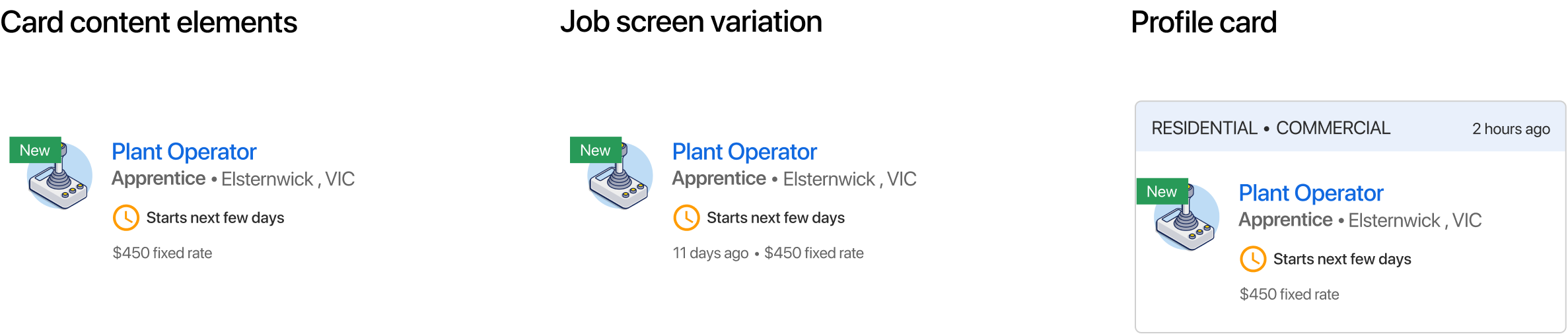
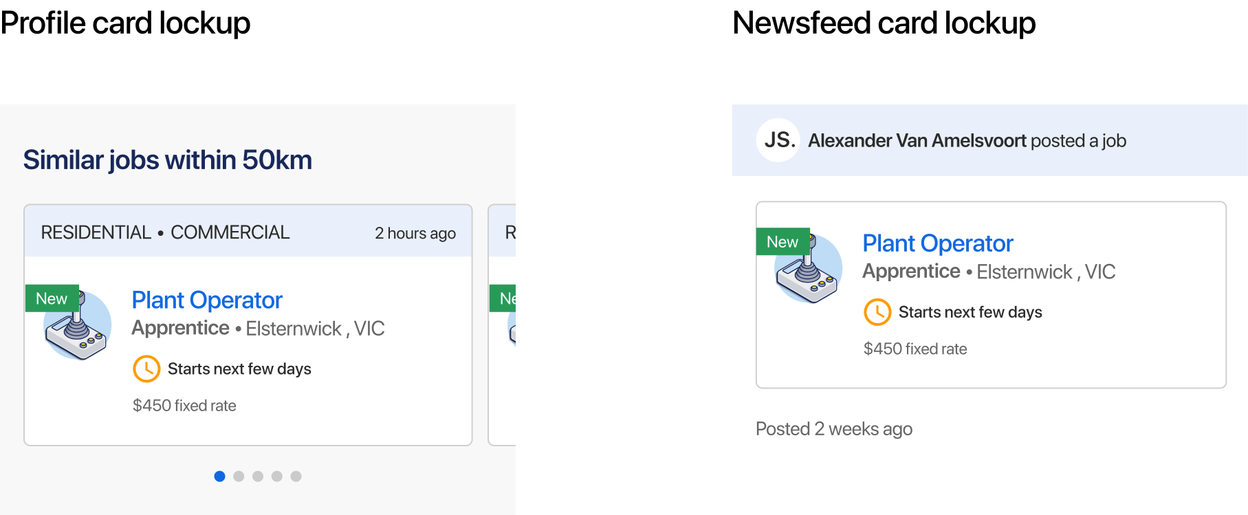
Job cards – UI refresh
An important UI update was the job cards, and they appeared in a number of different contexts thoughout the app. The task of finding work was an important one for Goodwork, so we wanted to bring a fresh, new updated UI design to the listed jobs
Tradies needed to quickly view the important info about the job and to be able to intuitively tap through to see more destail and then decide to apply or not.
The Atomic design approach was a great way to break up and organise these components, so I looked at setting up the design system to reflect this approach.
The job cards was a good example of how the Atomic design woud allow Goodwork to build, manage and maintain scalable designs.
Molecules
Organisms
Setting up components and varients
The radio buttons I proposed we update, played a big part in the ‘post job’ form, a significant user task and a key user goal in helping tradies find subbies.
After new UI designs were handed over to the dev team, I created ‘master’ compoments and set up varients in Figma.
This process was a bit ad hoc and inbetween other design tasks I'd make time to continue with other components, organise and construct these master compents and varients.
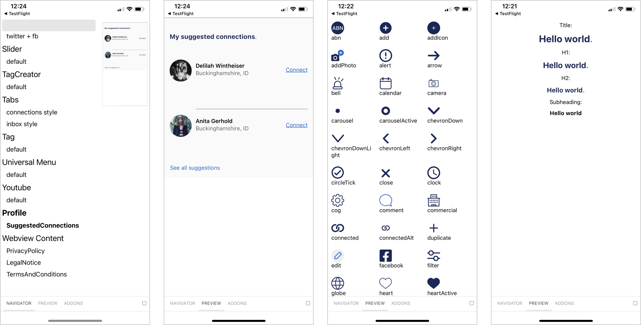
Storybook
Storybook was being used by engineering but there was no system in place to make sure new Figma UI components were always in sync with the live app.
My intention was to look at the Figma to Storybook workflow, and together with the devs figure out the best way to integrate the two.
Storybook contained a mix of old and new UI components - an approach was needed to move towards the new components without creating a mess of old and new components.
Some discussion points were:
– Clean up and remove old UI components in Storybook
– Discuss and define a naming convention for design tokens such as colour and make sure Storybook is aligned
– Make sure the correct components were used in the right places
– Figure out a way to keep design in sync and always reflecting the latest UI design in Figma
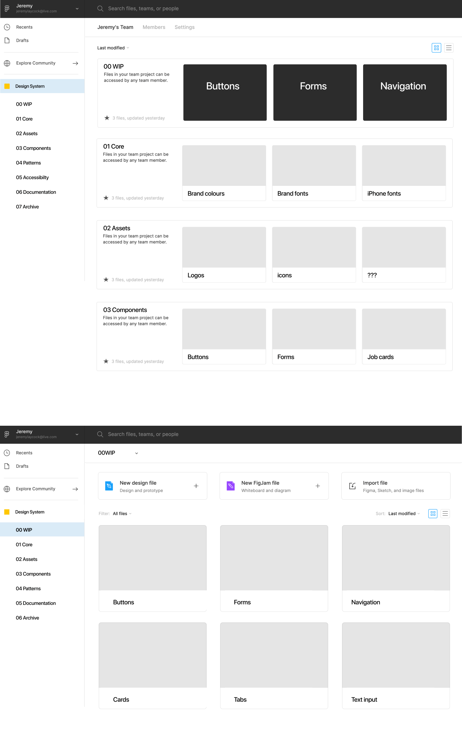
Figma organisation
After some research/ talking to other designers, I began some initial exploration - ways we could approach the organisation of the design system within Figma that might suit the Goodwork team.
For example, creating a separate Figma 'Team' for the design system and within that a number of 'Projects' containing different sections of the system such as Core (tokens), Assets and Components.
LEFT: AEMO’s (courtesy of Daniel Wang) organisation in figma
RIGHT: Onfido’s organisation in figma

In summary
This was an enjoyable project where we accomplished a lot.
I helped Goodwork make substancial progress in their product roadmap by releasing some important features while getting the design system underway and uplifiting the UI style with upgrades to key components across the app.
I’d love to chat about how I can help you. Say hi over email.
Contact me
© Jeremy Laycock