
UX / UI DESIGN
___
PageUp
Productivity & learning
Mobile + tablet app
My role
I joined PageUp as a UI and Interaction designer to help design their new 'Everyday Learning' app for mobile and tablet.
It was important to define scenarios and map out flows and key tasks to begin the process before developing the UI and visual language.
In collaboration with team members, we sketched out interaction solutuions and to help us progress and a low fidelity interactive prototype was created. Working closely in parallel with developers was cruitial to effectively integrating the UI design into the product build.
The opportunity
Employees found logging into a system to consume formal company driven content archaic, impersonal and not relevant or valuable. The result is lower adoption of formal learning management systems and an increase in less traditional learning.
To solve this, a native app was developed to record informal learning undertaken and share resources with collegues in an intuitive, organised and engaging manner.
Tasks and deliverables
User flows and scenarios, wireframes, paper prototype, sketching IxD solutions, visual language definition and exploration, UI and interaction design, delivered high fidedelity UI assets and specifications.
Tools used

MVP / phase 1 flows
The first step in the process was to look at the wholistic flow and make sure we had the first phase mapped out.

key scenarios mapped out
Once the MVP flows were with the dev team, we then focused on mapping out key scenario for the next phase. It was important to make sure we were designing what mattered most and mapping out scenarios was a good way to think about the context around user needs and that it all flowed naturally and logically.
Not having access to feedback from direct users is often the case in these type of projects with a quick turnaround, so we had to test flows with other people outside of our team and rely on ux principles and best practice to help inform our decisions.

Testing flows with paper prototypes
Paper prototypes was a quick and easy way to demonstarte flows and interactions with team and others outside the team for feedback.
Solving design problems
Time was against us so we rapidly worked through the more complex and important interaction design problems with pen and paper. This was critical in making sure flows and interactions made sense before jumping into higher fidelity UI.

Team collaboration
Collaboration sessions with team were important to get everyone up to date on flows, ensuring we were on the right track and to fill in gaps where necessary so we could move forward.


Visual language and style
Creating the right personality
The inception diagram became the source of truth to refer back to during the process and we used it to help us define the visual language and mood. It was a great tool to kick start the UI design 'look and feel' process and help us get to a place where everyone was on the same page about the visual direction.

Exploring styles with mood boards
I explored four different visual styles which helped the business move towards defining what the Learning app style would look like.
It was decided a 'minimalist' style was the desired direction for the learning app. A minimal design approach meant that the content users would be sharing became the focus without distractions.

Colour exploration
With a clear idea of style direction, I then looked at colour and created a number of different colour schemes. We deciede to run with the top left which was more aligned with the personality defined in our inception diagram.

UI elements and components
To make sure we had UI consistency and a coherant look and feel actoss the app I started creating the core components and bringing them together on one page. Each elemnt needed to align with our defined design language and personality.

Bringing the elements together on mobile
Following a task focused design approach was important especially for the small screen with limited screen real estate, to help users achieve their goals.
.
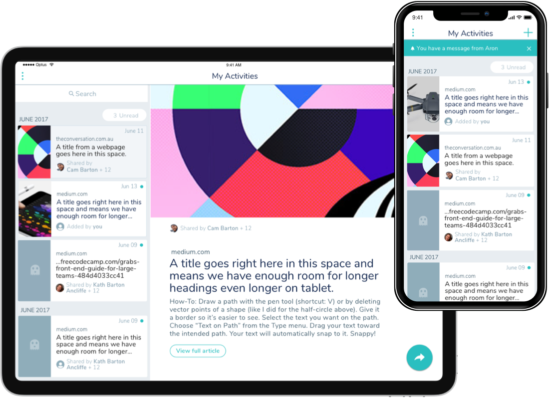
A cohesive experience across multi devices
A truly seamless experience as users move between devices and context. Familiarity in UI and interaction as well as making the most of the device realesate helped to create a ‘delightful’ experience.

Working closely with engineering
Clear UI and interaction design specifications helped speed up development and allowed for a smooth build resulting in a great results.


Outcome
The app came together and the business was wrapped with how it turned out, so much so that the UI template style was carried through and used as a white label for other projects within the other teams.
I’d love to chat about how I can help you. Say hi over email.
Contact me
hello@jeremylaycock.com.au
© Jeremy Laycock