
I am passionate about improving digital products so people can interact with them naturally and intuitively. I also strive to create meaningful and lasting connections through UI and visual design. More about me.
As part of a Human-Centered Design approach, AI is integrated into my process to optimise efficiency, with critical thinking applied at every stage.
Take a look at my projects below
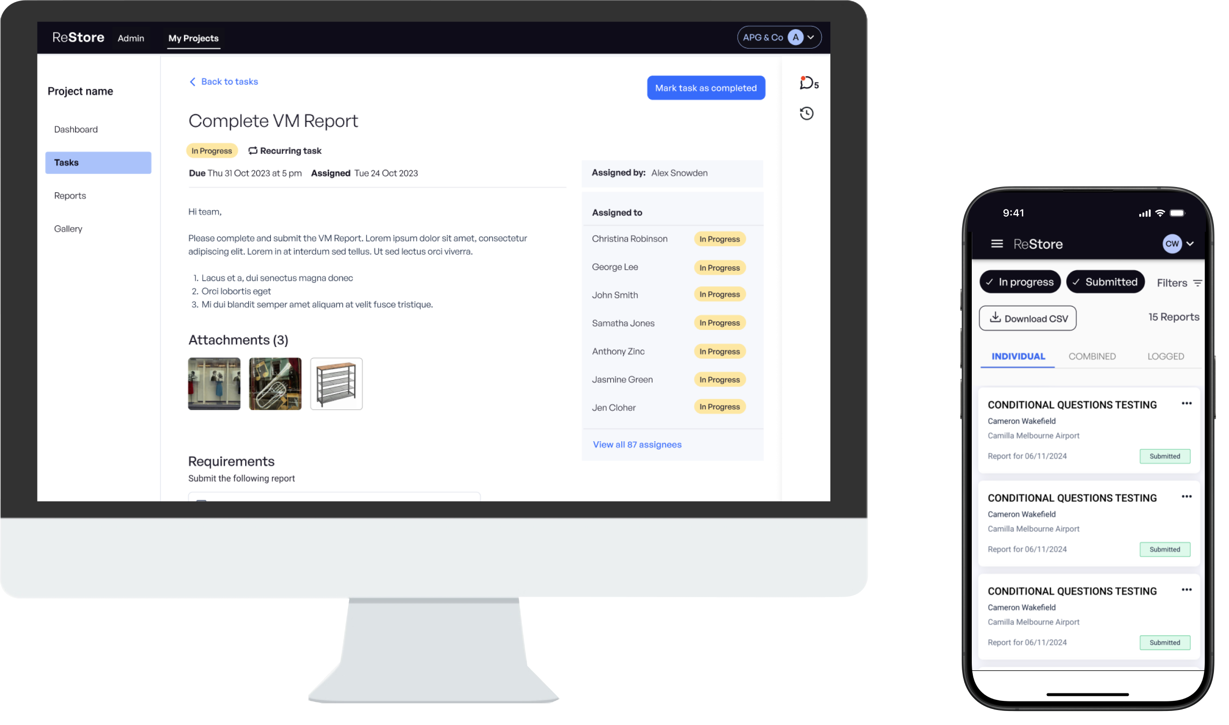
Retail SaaS platform
UX / UI / PRODUCT DESIGN
I led the design of core features for ReStore for Retail, empowering store associates and managers to streamline daily operations through visual merchandising and task management. Enhancements like assigning tasks via complex forms improved usability and communication, with the recurring tasks feature adopted by 60–75% of brands and enhanced task comments used by over 70% of managers within the first month.
I also developed a visual language and UI style guide, helping move the platform toward a cleaner, more cohesive design. Through user-centred design and collaboration, the platform became more efficient, intuitive, and well-received.
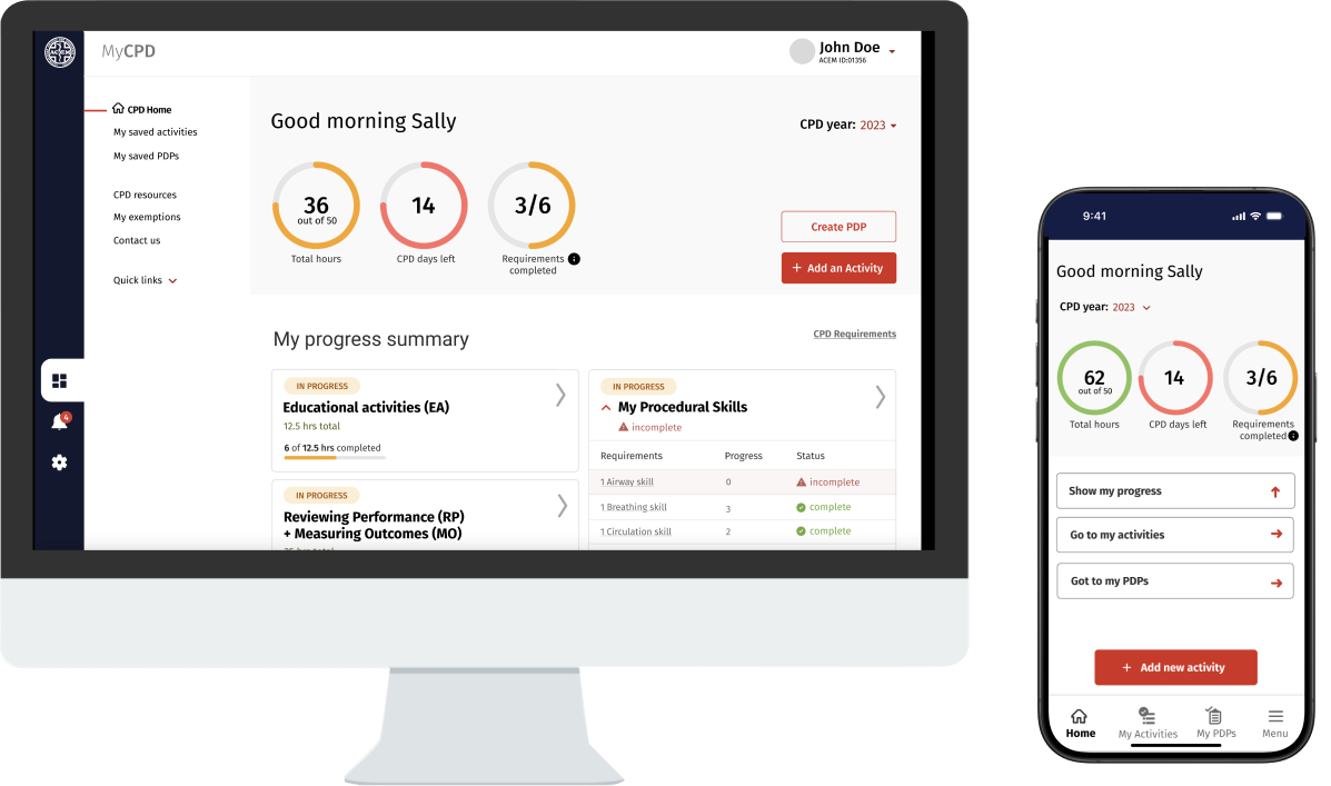
Australasian College for Emergency Medicine
CPD portal
UX / UI DESIGN
I led the redesign of ACEM’s CPD Portal, creating a modern, accessible, and WCAG-compliant interface that streamlined logging and progress tracking for emergency medicine professionals. Early feedback and surveys showed increased user satisfaction and engagement. Post-launch, log completion rates rose by 15–25%, helping meet business goals through improved efficiency and a more intuitive CPD experience.
Case Study shown on request
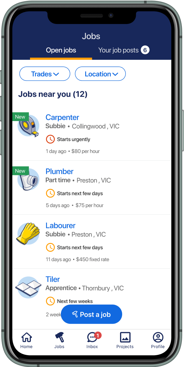
Tradies and jobs
UX / UI / PRODUCT DESIGN
I joined the Goodwork project, a mobile app connecting tradies to find jobs, hire workers, and collaborate. Leading design improvements, I enhanced usability and streamlined core tasks like job cards and the “set status” feature, boosting user engagement, job posts rose 26%, and 20% of members adopted the status feature. I addressed pain points and balanced user needs with technical constraints, helping tradies find jobs more efficiently and confidently.
I also initiated a new UI component library to ensure design cohesion and accessibility compliance, working closely with product and engineering teams.
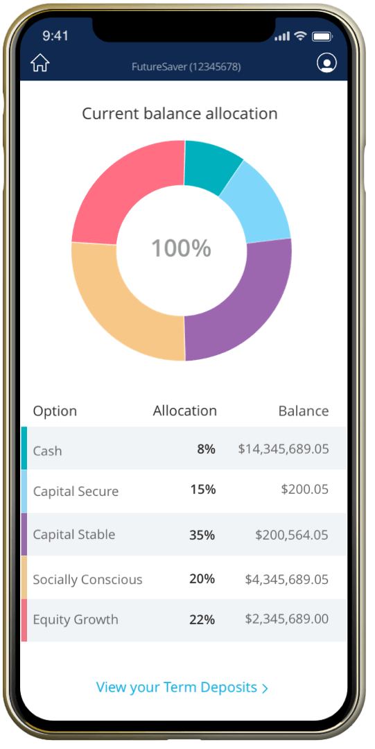
Superannuation
UX / UI / PRODUCT DESIGN
VicSuper, a profit-to-member super fund, needed to catch up to competitors by introducing a mobile app that would provide younger members with a more engaging and accessible way to monitor their superannuation progress.
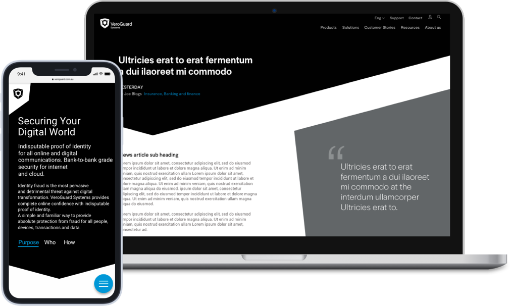
Cyber security
UI / VISUAL / INTERACTION DESIGN
VeroGuard is a leader in cybersecurity, preventing unauthorised access to cyber systems and data. The new UI design revamp across mobile, tablet and desktop needed to reflect their promise and convey trust, security and safety.
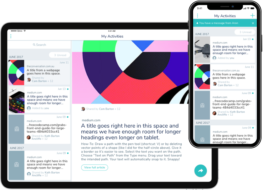
Productivity & learning

UX / UI / INTERACTION DESIGN
Pageup who focus on HR software were working on some internal projects. One of which was a mobile and tablet app developed to enable users to easily record informal learning undertaken and share beneficial resources among their colleagues.
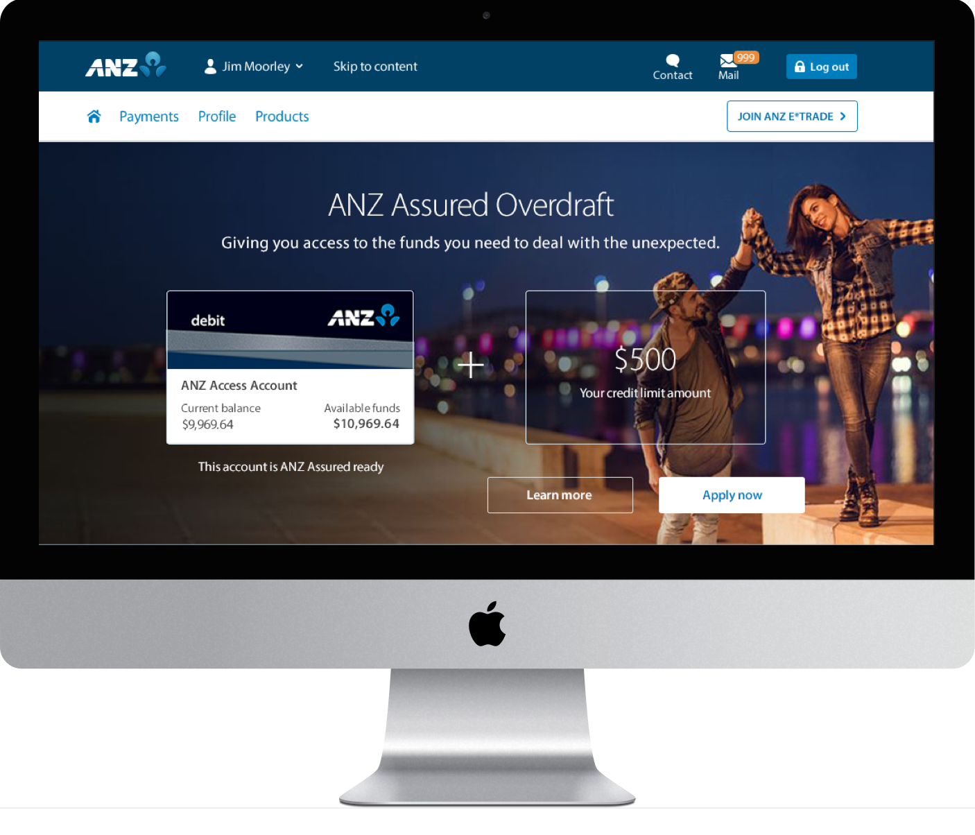
Overdraft application
UX / UI / VISUAL DESIGN
ANZ Assured is an overdraft product that helps banking customers cover unexpected shortfalls. The process of applying for ANZ Assured was an arduous task and with outdated UI, the overall experience needed to be greatly improved.
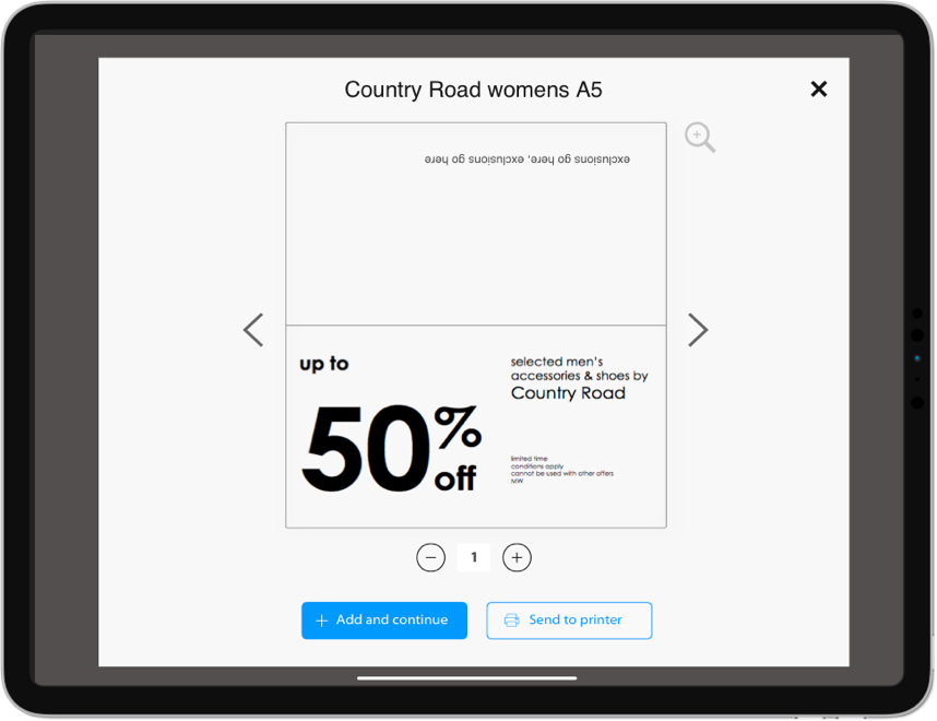
Retail (Staff ticketing)
UX / UI / INTERACTION DESIGN
An overhaul of MYER's outdated system would allow floor managers and team members to find and print tickets while walking the floor, greatly improving efficiency and ease of use.
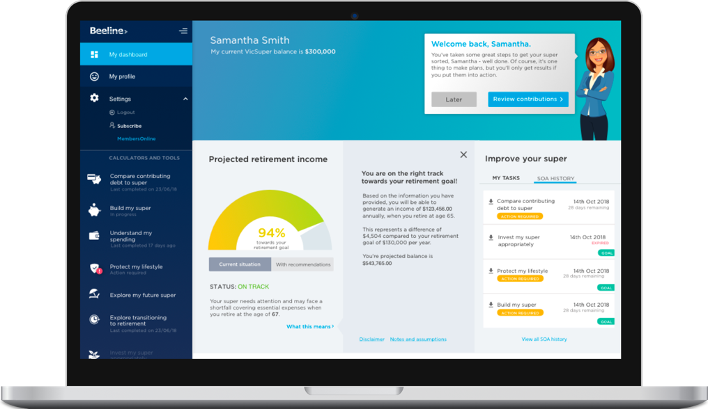
Financial tracking
Web portal
UI / VISUAL DESIGN
Beeline is an online tool that helps users set simple financial goals and track their progress. As part of the redesign, the UI and visual design needed to align with VicSuper's updated digital styles. With the complexity of the tool came a number of new UI components and screen layouts which needed to be created.
I’d love to chat about how I can help you. Say hi over email.
Contact me
hello@jeremylaycock.com.au
© Jeremy Laycock